Cramming every point onto one slide guarantees none of them land
It seems reasonable to assume that if you want your audience to notice something important, you should make it stand out, and if you have several important things, you should make all of them stand out. Garr Reynolds points out why this instinct backfires: if everything is emphasized, nothing is. A slide where every column is a different bright color, every line of text is bold, and three images compete for attention gives the eye nowhere obvious to land, so it wanders and eventually gives up.
He draws on the work of Harvard psychologist Stephen Kosslyn, author of Clear and to the Point, who studied exactly this problem. Kosslyn's principle of salience holds that attention is drawn to large, perceptible differences, meaning the most important element in a design should also be its most different one, not simply its largest or most colorful. A background full of visible pattern or detail, Kosslyn warns, has too much salience of its own, and it will pull attention away from whatever sits on top of it, regardless of how big or bold that foreground element is.
Reynolds finds a five-hundred-year-old version of the same idea in the tokonoma, the raised alcove found in traditional Japanese rooms, where a single scroll or flower arrangement is displayed. Nothing else decorates the room. There's no clutter competing for the eye, because everything else in a traditional Japanese room was deliberately kept plain, which is exactly what allows a viewer to notice, and then linger on, the one object the room was built around. Reynolds notes that a powerful focal point doesn't need to be overbearing or fancy; emptiness around it is often doing more of the work than any decoration could.
The practical version of this, for a slide or a poster, is to decide in advance what a viewer should notice first, second, and third, and then use contrast deliberately to enforce that order, rather than hoping that adding emphasis everywhere will somehow help everything get noticed. As Reynolds frames it, every good visual needs a clearly dominant element that tells the viewer where to begin. Without one, the viewer has to do the work of deciding what matters, and most of the time, they simply won't bother.
Before your next slide goes anywhere near your software, decide on paper what you want a viewer to notice first, second, and third, the same way a traditional Japanese room is built around a single alcove display and kept plain everywhere else. Make that first element different from everything around it, whether through size, color, brightness, or position, rather than simply making it big alongside other big things. Keep your background as quiet as you can, because a busy background has its own pull on the eye and will compete with whatever you place on top of it. Once it's built, show it to someone cold and ask what they noticed first; if they hesitate or name something you didn't intend, you have too many things fighting for the same attention, and it's worth cutting until only one clearly wins.
What You'll Achieve
The listener stops trying to make every element stand out and instead deliberately designs one dominant focal point per slide or page, resulting in visuals that guide a viewer's attention in a clear, intended order rather than leaving it to chance.
How to guide the eye instead of hoping it finds your point
Pick one dominant element before you design anything else.
Decide what the viewer should notice first, and build everything else around supporting that choice.
Make your most important point the most different, not just the biggest.
Salience comes from contrast, whether in size, color, position, or brightness, so the key thing should stand out against everything around it, not simply be large.
Keep backgrounds quiet.
A background with a lot of visible pattern or detail competes with your foreground elements, so save visual complexity for the one thing you want noticed.
Test your design for exactly one clear starting point.
If a colleague looks at your slide and can't say what to look at first, you have too many things competing, or nothing clearly leading.
Reflection Questions
- In your last presentation, could someone tell you, without hesitating, what they were supposed to look at first?
- Where are you emphasizing multiple things at once, and what would happen if you picked only one?
- Is your background quiet enough to let your foreground element actually win the viewer's attention?
Personalization Tips
- A conference organizer designing a poster makes the speaker's name the single largest, boldest element, and reduces every sponsor logo to a smaller, uniform row at the bottom.
- A product manager presenting a roadmap uses one color only for the milestone that matters most this quarter, leaving the rest in gray.
- A homeowner arranging a bookshelf leaves the rest of the shelf plain except for one framed photo, which becomes the obvious focal point of the room.
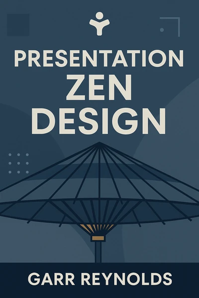
Presentation Zen Design: Simple Design Principles and Techniques to Enhance Your Presentations
Ready to Take Action?
Get the Mentorist app and turn insights like these into daily habits.